The Execution
Our approach was to embrace the omnichannel philosophy of pursuing relevance by focusing the experience around the customers’ context and not vice versa. Our belief is that a successful implementation of an omnichannel strategy that builds a solid launchpad for future growth will naturally position Woolies as a company that is both relevant to consumers’ needs and as a brand striving for innovation.
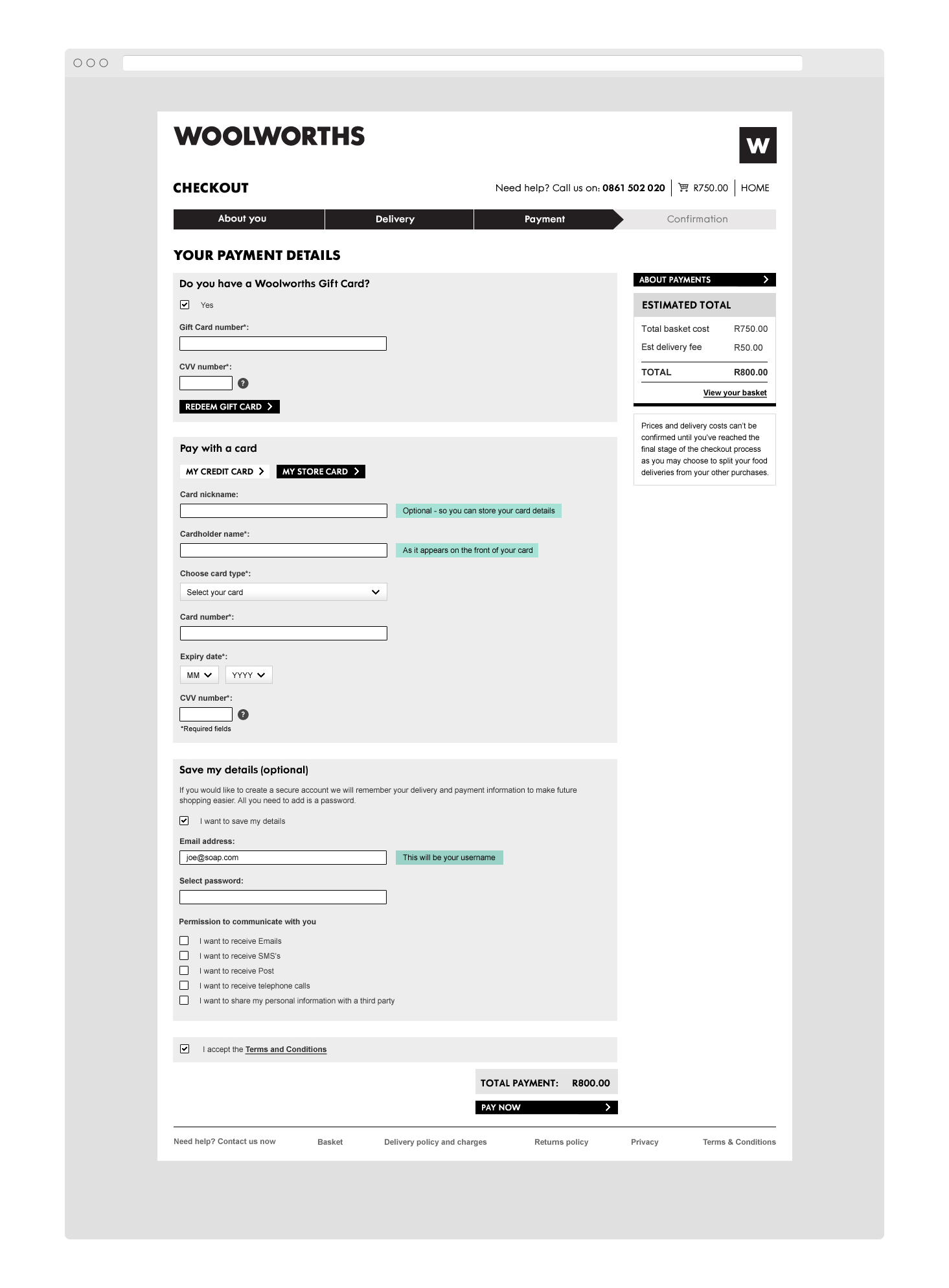
What we needed was a completely overhauled responsive eCommerce platform, accessible across smartphones, tablets, and desktops. An experiential platform that would integrate a high level of editorial content to inspire and engage the Woolies shopper and a finely tuned shopping and checkout workflow that maximises basket size and conversion rate. We absolutely needed to ensure that customers' experience mirrored that of the offline store: The veritable treasure chest of yummy foods and latest fashions, the product inspiration and innovations and the intuitive layout. We relied on technology, user experience and design as well as our 3 guiding principles to do so.
1. Make it accessible
You never have to look too hard in a Woolies store to find what you’re looking for or come across some inspiration for a feast that you didn’t even know you wanted to make or a special on something you didn’t know that you had to buy. It’s like stepping into a new world and we enjoy our online world being the same.
Responsive: We wanted to cater for South African shoppers across multiple devices and contexts. A responsive platform was non-negotiable. We built it around 3 breakpoints: smartphone, tablet and desktop employing the innovative use of the front-end tool SASS – an extension of CSS3 that allows for greater flexibility while maintaining structure and simplicity. The front-end layer was built on top of Oracle’s Endeca Experience Manager and Oracle’s enterprise-level ATG eCommerce platform.
Single sign-on: To mirror a customer’s in-store experience where all of their details and rewards are linked to their Woolworths card, we initiated an extensive customer database integration project with the aim of pulling together various pockets of customer data into a single consolidated view. This project enabled Woolies to offer a single sign-on experience across multiple internal businesses (shopping, loyalty, finance) giving customers a dashboard view of their relationship with the brand: everything from transaction history to their WRewards vouchers and the brand a single view of the customer.
2. Make it engaging
We wanted them to love it enough to talk about it with their friends. With the redesign, it was really important to us to bring the brand experience to life. Taking inspiration from the stores and applying them to the new site to create a stronger brand presence and a consistent user experience would be key. We looked at everything from signage and store layout to flashes on the packaging and the WMag to guide our navigation, typography, editorial content and user flow. Combined with Woolies signature CI, we were able to craft an online extension of your favourite Woolies store.
User Experience Planning & Architecture: An extensive series of discovery and requirements gathering workshops were run by the UX team to ensure that customer experience leads the decision-making process. To ensure that customers would be able to find products easily and intuitively as they do in-store, we conducted numerous forms of user testing and analysis (Treejack testing, card-sorting, focus groups, vertical reviews) and combed through all available site search and Google Analytics data.
When dealing with a catalogue of over 200 000 products across a wide array of categories, we knew that our navigation approach would be key. To achieve a navigation experience that was more dynamic, provided fewer choices at each level and did not dictate the user's path, we needed to move away from the more conventional/traditional ‘mega-dropdown’. We also took care to tailor the navigation experience to the different devices whilst maintaining a consistent experience.
Content that supplements the experience: We wanted to create a world, not just a shop and knew that the role of editorial style content (e.g. recipes, beauty and fashion tips) could not be underestimated. With this content approach, we aimed to increase engagement with the site, drive organic search results and referral traffic and establish a Woolies community. Working closely with the Woolworths Online content editor, we helped Woolies develop a content strategy following which we designed the appropriate templates to house the various forms the content could take.
3. Make sales
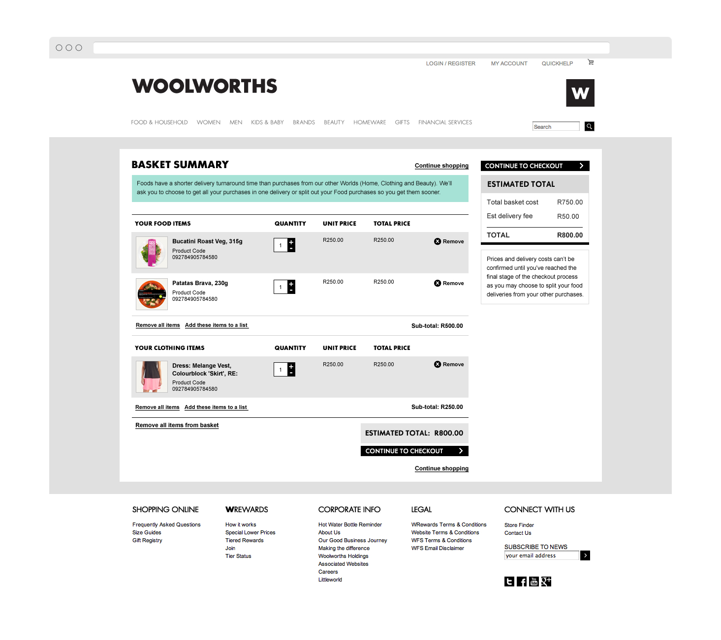
Why invest in a project like this unless it’s going to deliver a return? The existing website had limited views of products so we used international standards and best practices to create product templates that showcased the products and prompted actions at the strategic points of the shopping journey. We identified that the shopping journey is different for Food and Clothing/ General Merchandising shoppers and we tailored the templates in these areas accordingly.
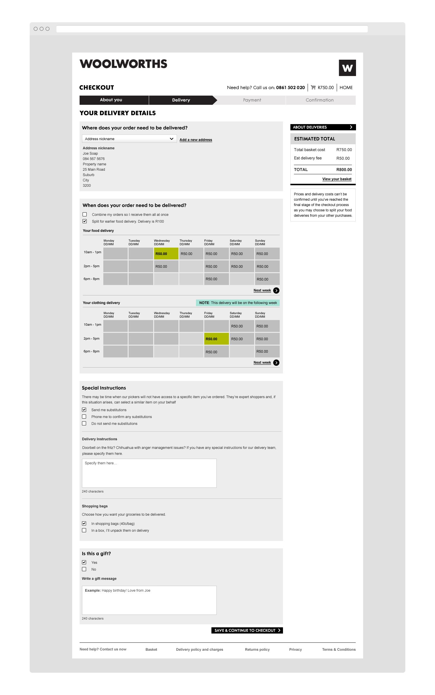
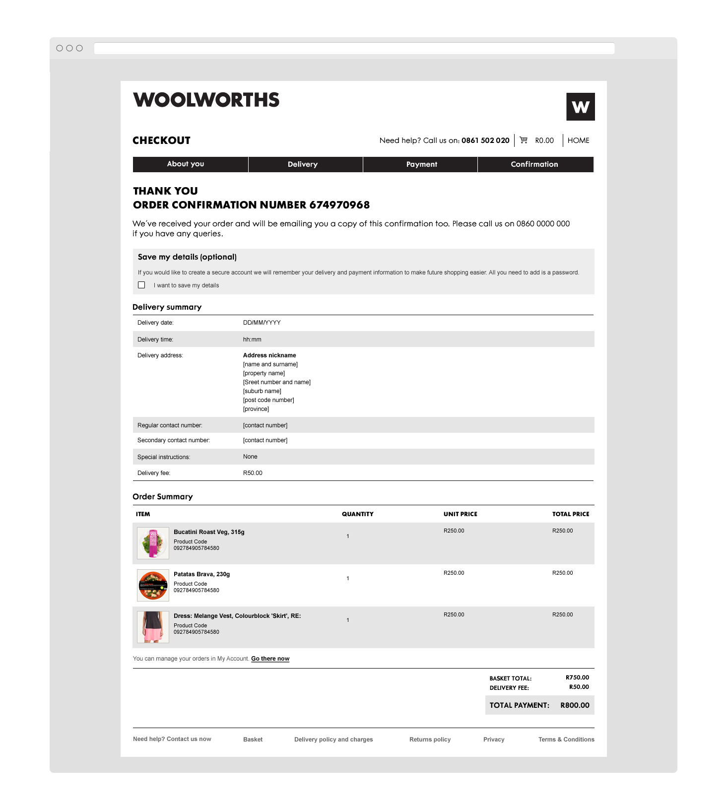
We also introduced additional ‘quick view’ overlays which allow shoppers to conveniently add items to lists, registries, and their favourites or share them on the various social channels. Through a close focus on data and user behaviour, we were able to create highly optimised “shop to checkout” workflows and user journeys. While conversion optimisation is an ongoing practice, we have already shaved 5.43 pages off of the average purchasing visit.
Results
The site delivered an enjoyable, shareable experience – 858 mentions on Facebook, and 97 on Twitter (overwhelmingly positive) in the period after launch (3 weeks), boosting Woolworths’ public profile and generating some great sentiment examples.
5,43 pages (10%) have been shaved off the average purchasing visit. By making it possible to add products to the cart from the product-listing page, the shopping experience for our transacting customers has been streamlined.
174 315 more pageviews in 6 weeks than the 6 weeks prior to launch (2.3% increase).
29% more time spent per visitor in the browsing phase. The duration of non-transactional visits (excluding bounces) has increased from 7m34s to 9m47s.
15% longer browsing visits on mobile devices (on average 1m18s), even though the site now loads 23% faster on mobile devices.
63 021 unique visitors (10.7% of all visits) visited the all-new editorial content sections in the first 6 weeks after launch. These articles and recipes enjoy 1m01s average time on page (39% more than the overall site average time on page of 0m44s).


