Elements are UI items that can’t be broken down any further and they serve as the elemental building blocks of an interface. Responsive grid and spacing.
If atoms are the basic building blocks of matter, then the elements of our interfaces serve as the foundational building blocks that create all of our user interfaces. These elements include basic HTML elements like form labels, inputs, buttons, and others that can’t be broken down any further without ceasing to be functional.
In the context of a design system, elements demonstrate all your base styles at a glance, which can be a helpful reference to keep coming back to as you develop and maintain your design system. But like elements in the natural world, interface elements don’t exist in a vacuum and only really come to life with application.
Components are collections of elements that form relatively simple UI components.
In interfaces, components are relatively simple groups of UI elements functioning together as a unit. For example, a form label, search input, and button can join together to create search form components.
Creating simple UI components makes testing easier, encourages reusability, and promotes consistency throughout the interface.
Modules are relatively complex component groups that form discrete sections of an interface.
Modules can consist of similar or different component types. A header module might consist of dissimilar elements such as a logo, primary navigation list, and search form.
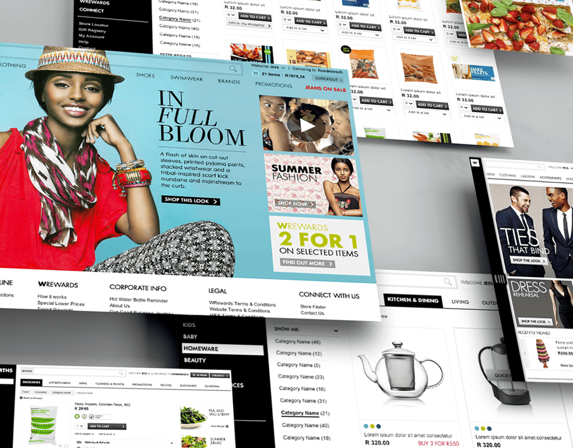
While some modules might consist of different types of components, other modules might consist of the same component repeated over and over again. For instance, a category page of an e-commerce website has a listing of products displayed in some form of grid. Building up from components to more elaborate modules provides designers and developers with an important sense of context.
Modules demonstrate those smaller, simpler components in action and serve as distinct patterns that can be used again and again.
Templates place modules and components within a layout and demonstrate the design’s underlying content structure.
Templates are page-level objects that place components into a layout. Another important characteristic of templates is that they focus on the page’s underlying content structure rather than the page’s final content.
By defining a page’s skeleton we’re able to create a system that can account for a variety of dynamic content, all the while providing much-needed guardrails for the types of content that populate certain design patterns.
Pages apply real content to templates and articulate variations to demonstrate the final UI and test the resilience of the design system.
Pages are specific instances of templates that show what the UI looks like with real representative content in place.
The page stage is the most concrete stage of design, and it’s important for obvious reasons. After all, this is what users will see and interact with when they visit the site. And this is where you see all those components coming together to form a beautiful and functional user interface.
In addition to demonstrating the final interface as your users will see it, pages are essential for testing the effectiveness of the underlying design system. It is at the page stage that we’re able to take a look at how all those patterns hold up when real content is applied to the design system. Does everything look great and function as it should? If the answer is no, then we can loop back and modify our components, modules, and templates to better address our content needs.
The responsive grid is the invisible glue that holds the UI together.
Responsive design is fluid and doesn’t have a fixed size because people are using different types of devices to interact with the product, from mobile devices to ultra-wide desktop screens.
People often move between multiple devices to accomplish a single task with a product or website. Despite screen size, designers must organize content in the most intuitive and easy-to-follow way.
A layout grid is preferable for responsive design because it defines the underlying structure of a design and how each component responds to different breakpoints and screen sizes. This type of grid is faster and easier to design for multiple screens and resolutions.
Scale objects using multiples of 8.
Space objects using multiples of 8.
Width is the dominant variable.
The active space remains divisible by 8 and 4, irrespective of the screen resolution.
The gutter size varies by device and is sized to make the active space divisible by 8.
Use padding for spacing within an element. Always try to add equal padding from the sides and top/bottom.
Margins are for spacing between elements.
Homepage - getsmarter.com


Campaign Template
Blog - getsmarter.com/blog


